Evolution and assessment of a pedagogy
Since 2002, the Master’s students at the Graduate School of Architecture of Nantes who are enrolled in the “Architecture in Representation” orientation have carried out a pioneering work in the use of digital tools. By adopting the most recent techniques and tools, they have transformed the architectural design approach, thanks to the integration of “narrative design”.
In fifteen years, students will have gone from the board to digital drawing, to immersion and virtual reality, including short films and interactive devices, without losing sight that the subject of the work is in fact the project, and not the tool. In doing so, they have questioned, led by their professors, the status of synthesis images, the challenges of interactive narrative and of the virtual world.
Within the school, time was needed to accept these explorations; the use of digital tools, long criticised, was blocking the appreciation of the content and the students’ experimental approaches. Nowadays, the experience from these past fifteen years lead us to ask this question: do digital tools renew the design paradigms, or are we only involved in the evolution of practices through the integration of other means?
Introduction of the context
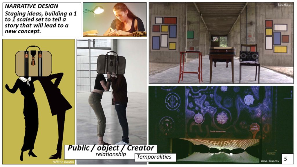
The proposition of the Master’s “Architecture in Representation” orientation was born as the first digital rendering tools (CG rendering) were starting to be accessible for students. We were the only professors trained in 3Dstudio, in WRML and in 3D modelisation, and we had been mandated to support the projects in their communication phase. However, it soon appeared that the making of images without a visual culture turned the exercise sterile, and mostly vulnerable to criticism, both aesthetic and formal. At the beginning of the 21st century, examples of digital rendering displaying architecture were characterised by long travelling shots that we could already see in the remarkable and seminal reconstitution of the Cluny Abbey, back in 1992[1]. Nevertheless, do the travelling shots reveal something other than the digital prowess? Director Stan Neumann[2], guest in a masterclass, reminded us that filming architecture was not just moving within a static object. Each camera movement should be significant, and each shot, in its duration, should tell something, image after image. The challenges of digital renderings have then articulated themselves between filmed space and the question of temporality. Our pedagogy has therefore been structured around the concept of chronotopia[3], enabling the introduction of temporality in architecture. For example, it is the light during the day, the life of a street over 24 hours or History in the long-term. This approach has given students strong arguments to defend their project and claim rational choices that we can share. We have then reversed the mode of production of the project. Instead of starting from a programme, we asked the students to begin with a story that they would create. This approach can be called “narrative design”[4], even if the English-speaking world usually uses this concept to refer to interpretation, in addition to creation[5]. The narrative feeds the formal imagination, and should do a hypotyposis[6].
The “Architecture in Representation” teaching unit was proposed in 2001 at the time when students were switching from the library to Google. If architectural studies are characterised by the heavy use of images, those are images from magazines, websites or documentaries, as well as produced images, such as photographs, plans, sketches, 3D productions, which are wildly enjoyed. Students are also hungry for fictional images, that they find in cinemas, on their computers, and more and more rarely on television. They are similar to their elders in their studies, but with a media density and copresence that are unprecedented.
A complex appropriation
Nowadays, nearly a century after Le Corbusier’s first travels and the “Journey to the East” notebooks[7], the young future architects have the opportunity to go all over the world, but they fill out fewer sketchbooks than megabytes of photographs taken without any limit in terms of support or storage. The relationship to images is different, and the abundance creates a sort of digital bulimia, which is found both in the production and in the consumption. In terms of the architects’ training, we should thus dedicate ourselves as intensely to the modes of production, their aesthetics and to the forms of speech accompanying any graphic production, and their evolutions. These past twenty years have seen the architects’ work environment radically change with digital tools. When the first computers appeared in agencies, in the 1990s, a transfer of skills occurred, and a set of new constraints appeared. By moving from the board to the screen, the image of the ongoing project was no longer visible at all times, it needed to be printed out to be examined or corrected, or that the designer be at his desk to control the machine.
The diffusion of computer science also influenced the communication of projects, and, by extension, the economic model regarding competitions. Beyond the norms tied to the plans, sections and elevations figuration, the communication of an architectural and urban project borrowed a lot, both in the style and in the intentions, from paintings and comics, even if one’s intentions diverge from the other’s aims.[8] The ambiance perspective is the image that conveys the final state of the building after its development, and gives it nature and spirit. Noble illustration if anything, it is usually the master’s piece, the architect’s signature. Everyone remembers seeing Franck Lloyd Wright, Mies Van der Rohe or Aldo Rossi’s sublime boards. Those illustrations are even more remarkable that they form with the project a powerful and coherent ensemble.
The digital image has disrupted the universe of architectural image, both in the form and in the writing of it. In France, the architects’ commitment to these new technologies is low, mainly because the personalisation of its aesthetics is complex, even more so than the technical adoption.
The first digital images, called synthesis images – term that enables the stigmatisation of an artificial origin – add fuel to the debate over the place of those images in the project’s development. They are, for most commentators, misleading.
In 1997, in its 75th issue[9], the professional journal Architecture compares the merits of synthesis images to images drawn with a pencil or painted. Given the youth of digital technology, the arguments work largely in favour of analogue tools. Far from being recognised as an emerging expression, the image that is produced by the computer is accused of not enabling the distinction between real and artificial. The question of resemblance is asked in a peculiar way: the figuration of the project, of an imaginary object, as an element for mental representation, would switch status to become the figuration of an object whose evolution would no longer be discussed. It was, of course, the confusion between the concepts of reality and realism, image and discourse that can potentially accompany it, which we can also consider as the confusion between signifier and signified.
The second criticism deals with what we can qualify as likelihood. Therefore, the synthesis image would free itself from the laws of physics, statics and nature, as it proposes figurations that have a false likelihood. The images could thus make believable constructions that are free of the laws of statics and of what materials and assembling can really achieve. The example of glass is also often mentioned. For everyone, glass is transparent and reflecting, and that is how it generally appears. However, one only needs to look around to see that glass windows never seem transparent from the outside, and that they are only passably reflecting, that they are rather black and opaque. In the case of projects promoting glass, there can be major differences between the realistic image and the real built product, which, in fine, questions the idea of contractual image.
Lastly, the third criticism put forward since the dawn of the digital turn, at the beginning of the 21st century, could be organised around the concept of correspondence. This concept has many ramifications: we can first mention the question of generation of form and correspondences between real and virtual. The ancient paper architecture, naturally associated with names such as Piranesi or Boullée, is followed by digital architecture[10]–[11], whose first virtuality questions the challenges of the relationship to reality. But it would be more accurate to ask this question in the past tense. In fact, the latest progress achieved in 3D printing and digital cutting technology materialise the most ambitious projects[12]–[13]. From computers, the designs that we used to call “non-standard architectures”[14], at the beginning of the years 2000 are nowadays grouped under the banner of parametric design[15]. Freeware such as Grasshopper[16] create important communities of users communicating in countless forums and writing mostly for two journals: AD architectural design magazine[17], the most prestigious one, and EVolo[18], the most graphic one. The study of the way projects are presented shows that the concepts of plans/sections/façades are losing readability the more the presented spaces are complex, giving even more power to the ambiance perspective.
The digital image is now used for almost every project rendering, and it is only rarely possible to recognise the architect’s “touch” in a competition board, often produced by a perspectivist, for whom it is the main activity. In the context of real estate development, the architectural image is standardised by very precise graphic codes. The building is shown in a comfortable environment where groups of passers-by display a young and sunny happiness[19]. On the contrary, stars-architects, like Jean Nouvel, transfer the personal codes of representation towards codes of graphic communication inherited from advertisement. The message hands over the subject while hiding the sender’s identity, or, in other words, while the illustration carried in itself the architect’s immediate authentication, sometimes more strongly than the project itself, this new form of figuration fully tells the project, while giving the illusion of anonymity for the designer. This is naturally not the case, and the architect, master of his communication, establishes a process in which the image serves a metadiscourse, where the accompanying text is more important than the project evocation by the ambiance perspective.
Writing with image
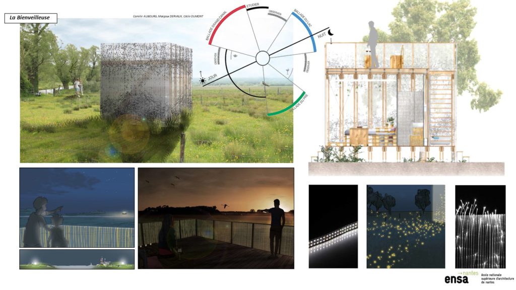
In less than ten years, between 2000 and 2010, our pedagogy has been completely revamped, given the fast evolutions of digital tools and of the productions’ formal vocabulary. The design of the rational argumentation has nevertheless shown its limits by removing the location’s poetics, the creation’s dynamics and the concept of reference. From this moment on, the project’s mode of production is thus reversed. It was about starting from the desired result to determine the project’s coherence. In a conventional approach, after a diagnosis or a feasibility study, an architectural programme is drafted in order to define the objectives of the future project, whether it is a landscape or urban unit, a building, a house or an airport. The programme describes the interactions between the different spaces and gives objectives in terms of surfaces and costs. The architect uses this document to transform the formal elements into living spaces, and the constraints are numerous, whether formal, organisational, structural, human, which makes it one of the most difficult professions. Reversing this process does not mean starting from a bunch of questions, but from a bunch of answers. We asked our students to imagine a mental and sensory visit of their project, without paying attention, for now, to the coherence. It would mean, for a house: “upon waking up, the parents’ bedroom is bathed in the morning sun”. This phenomenological approach, working with perception, with quality, will then be transformed in a formal way into a 12m² room with a big bay window facing the East. Qualitative design is thus facilitated, thanks to cognitive mechanisms that we will mention later.
For architect and professor Geoffrey Broadbent[20], there are four design methods: pragmatic, typological, analogue and geometric. Broadbent’s approach relied on a semiological approach and Chomsky’s[21] theories. We can perhaps add a meta-category, which would be narrative design[22], even if the English-speaking world also uses this concept for interpretation, in addition to creation[23]. Narrative feeds formal imagination, needs to become an image, or rather a hypotyposis[24]. Narrative design makes full use of the techniques of scriptwriting: one needs to create a context, place protagonists, determine a starting point, a disruptive element and a resolution. All that is embedded in a set of values that the story makes explicit. Figures of speech are used, the metaphor of course, but also the ellipsis, enumeration, comparison, etc. The project stems from the narrative, it is one of many elements, and not just the décor-vessel. According to us, it seems like 90% of the project’s design work is done when the narrative and the “décor-actor” or décor-protagonist is determined.
Narrative design uses metaphors
extensively, as the starting point for the creation process. First in the
description, with the example of this beautiful excerpt from Gracq: « La lumière poudreuse, ocrée et presque rousse n’égayait pas la petite
place ; il lui semblait plutôt qu’elle émergeait devant lui, étrangère,
plus déserte qu’un banc de sable que la marée recouvre.[25]» The characterisation of spaces with a metaphor creates a mental image
and gives indication on organisation, proportions, materials, colours,
situation, access and openings. A bedroom considered as a nest, for example,
implies being small, cosy and not easily accessible, perhaps a little secret. The nest can
also be a house: « Le nid comme toute image de repos, de
tranquillité, s’associe immédiatement à l’image de la maison simple. De l’image
du nid à l’image de la maison ou vice versa, les passages ne peuvent se faire
que sous le signe de la simplicité. [26]» The change of scale does not change the principle of narrative design.
In The Shape of a City[27], Julien Gracq demonstrated that there is no city without its mental
image. The image that he remembers from Nantes, made of passageways and
frontiers, structured his vagrancy in a space of subjectivity. However, once
again, the evolution of digital tools immediately questions our concepts: would
a generation Y student[28], with a smartphone that is also a camera and a GPS, as Julien Gracq
did, explore his or her mental memory since everything, places, moments,
weather, pathways would have been recorded with acute precision? Would he need
his digital crutch, or would it have helped him to see better?
Going beyond photorealistic aesthetics
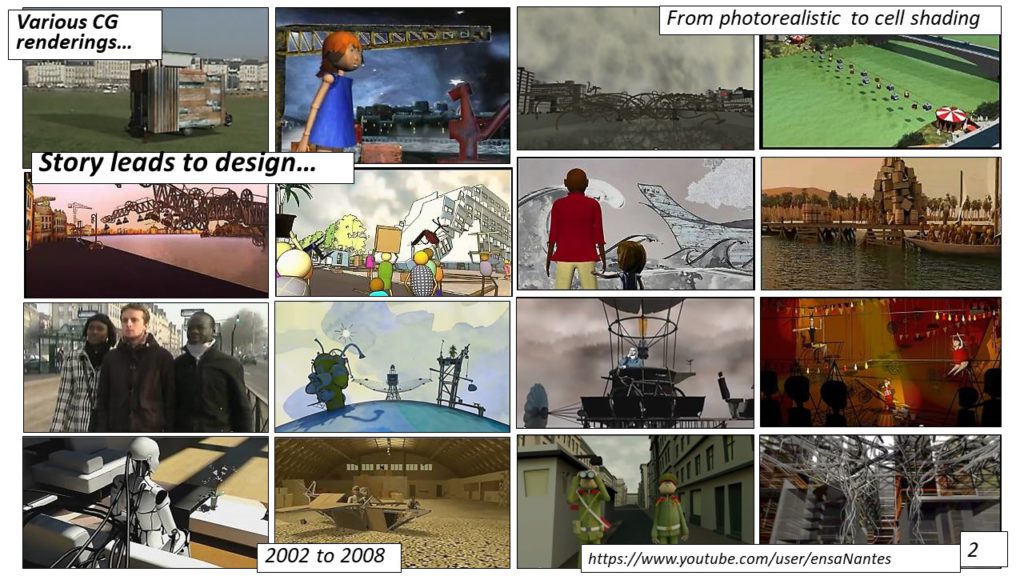
The use of digital tools in architectural design carries the risk of becoming ambiguous on what we aim at measuring: is it the possibility of making projects using computer science, is it to master those digital tools, evaluate the adherence to new educational forms or the teaching’s resistance, despite tooling that articulates real and virtual? Films directed by students between 2000 and 2013[1] show that digital tools can be integrated to the project, not only to design volumes, which is often the case with pedagogies centred around methods to generate forms, but also to describe perceptions and uses. The projects then develop a dialectic around the concept of transgression: therefore, the city of transgression counters the city of regulation. The more Space 1.0 is regulated and the more Space 2.0 is infringed. How is it expressed? For example, with the staging from augmented reality, which turns the invisible visible, or with the ability of digital tools to simulate ubiquity and debodyment[2].
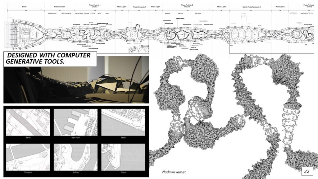
This transgression is perhaps the result of the method that is proposed to students. Starting from a situation in which History is very strong in a location, we asked them to invent a dramatic situation, whose resolution is solely dependent on the transformation of space, whether through an urban or an architectural project. This dramatic situation becomes the subject of CG short movies. First, the students develop a conceptual image, which sets a situation. From this image comes a pitch that describes, in a few lines, the context and the events of the narrative. Then, the development needs to be written, so that it can be divided into sequences and be turned into a storyboard. From there, the students propose an animation to understand the pace of the story, as well as the workload. Indeed, this animation will inform on the precise duration and by extension the number of images to calculate. After sketching the aesthetic features of each element, several phases will take place: modelling, texturing, lighting, rigging, animating and rendering. Knowing the rendering time for one image, it is easy to deduce how much time, and sometimes how many machines, are needed to present the film in time.
“Face à Face”[3] was directed in 2008 while we were working on the anniversary of the fall of the Wall of Berlin, and it is a prime example of the method. The first conceptual sketch showed two soldiers facing and studying each other with binoculars. The pitch was then as follows: two officers are watching each other with binoculars. They are on both sides of CheckPoint Charlie. The order is given: they need to build a watchtower that needs to be taller than the opposite side. The race starts, while a poor guy tries his hardest to cross to the West. The towers are getting taller, to the point of wavering, swaying and collapsing against one another, frozen in the shape of a giant bridge from East to West, wonderful metaphor for the conflict between East and West. Everyone runs to this unbelievable gateway. The project of bridge between West and East, celebrating the reconciliation between the two blocks is more original than the proposals that everyone has seen around at this time, which consisted in recreating the wall, whether in ice [SP1] or in another material.
Panoramic views
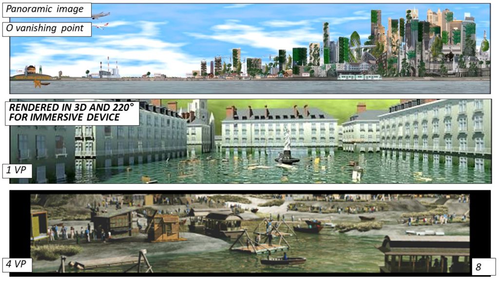
After about ten years working for the screen format, the students were asked to consider film narrative for another, bigger, more constraining medium: the Næxus screen. Næxus takes the form of an immersive bubble with an inner panoramic screen and speakers for a 3D sound restitution. Projection happens on a 1.50-metre-high and 12-metre-long cylindrical screen. The image surrounds the user, offering him or her an intense immersion. This also means that the viewer will not be able to see the whole screen, since the image goes beyond his field of vision. It is thus a question of inventing new ways of writing, to provide a configuration that is both spectacular in its produced effects and also constraining. The viewers are standing in the middle of an open cylinder, on which is projected an image with a 220° orientation. This angle corresponds to the extent of the field of vision, the visual limit being 62° on each side, i. e. 124°. The 16/3 image is 4096 pixels wide and 768 pixels high, which is much larger than the usual standards.
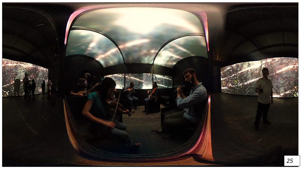
With immersive devices, we can immediately imagine an image with four or six vanishing points, as it in the case of those we get with a 360° camera. It is the case of the “Agrikultur”[4] and “Underground”[5] movies, which chose a classic production and segmentation. The viewer focuses on the centre of the screen, and the extension of the field of vision plays a part in the immersion. In terms of segmentation, the duration of the shots does not affect the understanding of the narrative. However, if the travelling shot offers strong visual sensations, the panels cause an unpleasant effect. The challenge of Agrikultur was to focus on a skyscraper within this panoramic format, masterly relieved by the ascending movement and the final zoom out. The solution provided by “La Petite Hollande”[6] works on a divided screen. It is enriched, and carries 2D graphic information as well as 3D scenes. It also switches between real-life shots and synthesis images. The soundtrack, particularly rich, is a simultaneous demonstration to the image, offering modern sounds and what would a city without cars sound like. The point is that of a permanent travelling shot as a long sequence-shot, as if recorded by a camera in one of the protagonists’ hand. The produced image looks a lot like what we imagine being augmented vision.
The film “Lavau”[7]chose an image without perspective, in the pure tradition of the Bayeux tapestry. The action moves from right to left, showing the progression of the city towards the Loire estuary. The viewer thus follows the action as it develops within the time of the narrative, and on the surface of the screen. Only a few insert points, on the left side of the image (where the plot is), are indicated by sound.
The “BZH – Bienvenue en Zone Humide”[8] is built from a unique vanishing point. Nantes is flooded, and Place Royale becomes a theatre stage. The camera is fixed, and the action unravels in the viewer’s field of vision. The entrance and exit happen within the décor, as it would happen in a classic scenography. The perspective distortions are found in the monocular viewing area. Small events still occur within the limits of the viewing zone, which makes the overall scene even more vivid. The film is organised around a long sequence-shot.
Real time and interactions

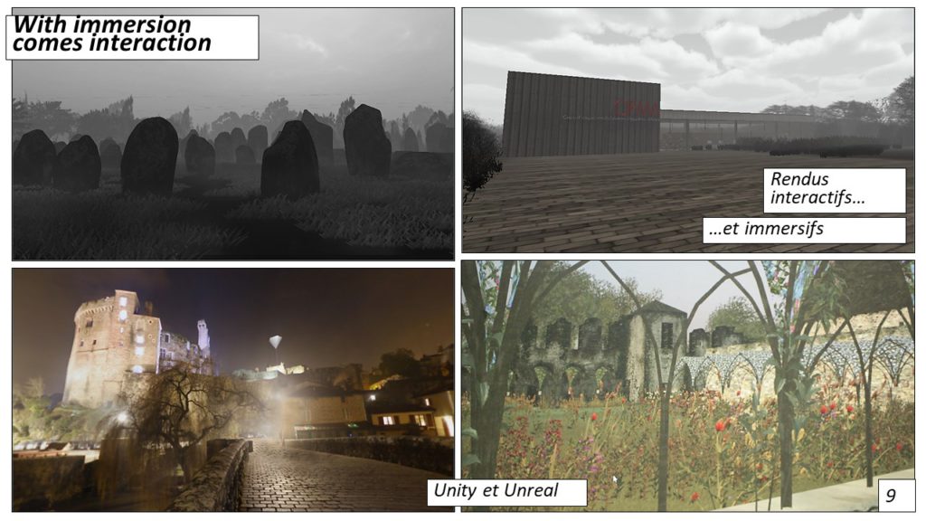
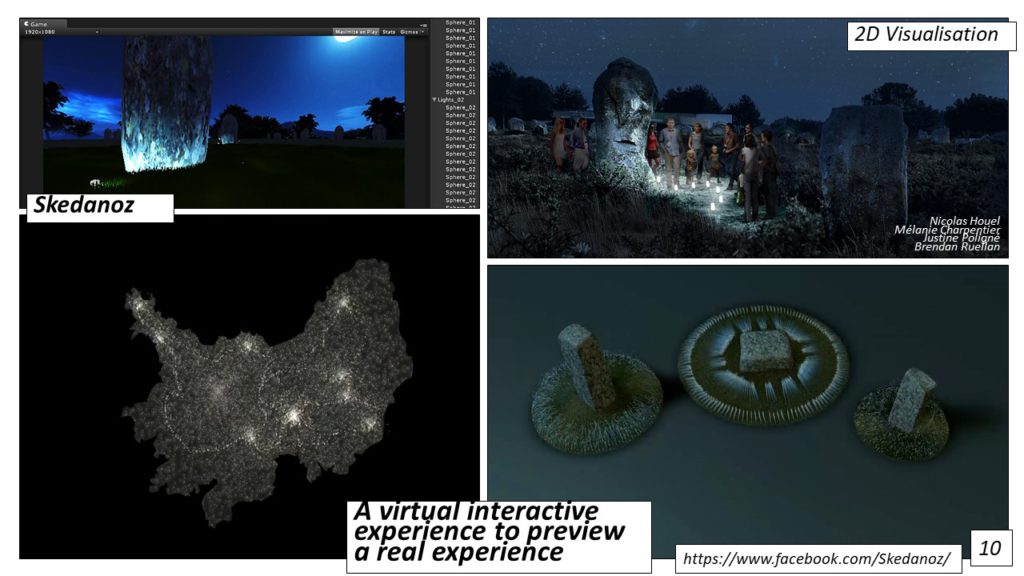
Created in 2005, Unity 3D was a major breakthrough ten years later, providing a tool bringing together both developers and artists. While we were inviting students to switch to game engines such as Crytech’s SandBox, or to integrated solutions like that of Blender’s Game Engine, Unity allowed the students to integrate a new production chain without altering the existing ensemble. The challenges have thus moved. Used as early as the design phases, the 3D engine invites the students to solve early questions of volumes and proportions by being immersed in their project’s spaces. They thus realise very soon that the classic movie grammar is not used in the same way, and that the questions of framing, plan values, focal length, are no longer in the hands of the director, but of the viewer. They also understand that the pace, the segmentation, the temporality and narrative flow are to be tackled with spatial design. In terms of narrative, the management of the off-camera is the most challenging element. In a classic narrative construction, the off-camera elements determine two spaces: for the viewer, it is an imaginary space. It is there, away from the screen, that the narrative is completed mentally. For the director, the off-camera elements represent the space where he can hide the technique “behind the scenes”.
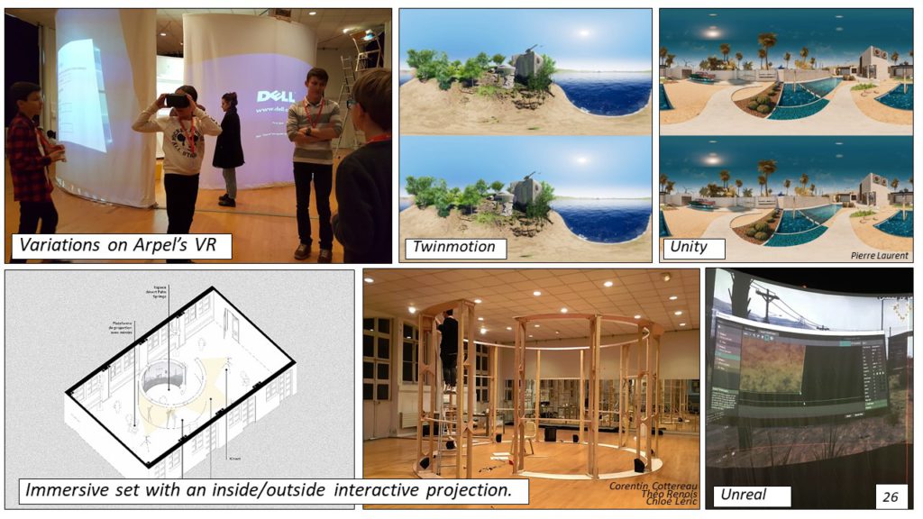
The “Clairmont” interactive visit proposes what is best in terms of 360° and real time. Nowadays, immersion is often assimilated to experiences of virtual reality in which the viewer lives, in real time and with the possibility to influence his actions, to the experience of another place. If that is acceptable to give an easy definition, it represents in fact a limitation of possibilities. As a consequence, many video games develop several temporalities[9]. For example, an hour only lasts two minutes, and a whole day happens over 48 minutes. However, everything seems to happen in real time. There are thus two simultaneous chronologies: the viewer’s and that of the diegetic space. The possibility to use several temporalities within one space allows for playing with temporal ellipsis, a major narrative figure of speech. In a story, in order to enhance the interest and the intensity, we move from continuous time to discrete time. In “Clairmont”, the story is developed around the real-time exploration of an abbey cloister. The visitor arrives in a space overgrown by the vegetation, and it is raining. He enters from an arch and starts discovering the ruins. After a first round, he walks under another arch and has already changed season. The rain has stopped and, unnoticed, a construction site has appeared. The structured vegetation has replaced the walls worn out by time. After a few more steps, summer has arrived and the cloister is shining with splendour, the woven rushes redefine the arcades and gives the place some of its past glory. But this proposition is fragile, and it relies on the user’s will to save the building or not. A few more steps can show what would happen if nothing is done. The wild vegetation reclaims its right, the cloister has been destroyed and the abbey is decaying. This temporal compression is explored within a unique, interactive and immersive space.
Conclusion
We mention more and more the digital revolution as a phenomenon similar to the invention of printing, in the middle of the 15th century in Mainz, Germany. It was characterised by a widespread dissemination of knowledge, with, as a result, a more egalitarian distribution of technical knowledge and skills. The observation of younger generations attempts to confirm this fact with the prevalence of tutorials, defined as a mode of self-learning with online classes, whether it is about languages, DIY, architecture software or music, philosophy or living together. Tutorials represent a class without exams, available at the right time, about an interesting subject. These practices, still very generational but spreading rapidly, recount quite well the uses and perceptions of what we used to call, ten years ago, computer sciences. At this time, digital tools appeared as a specificity, sometimes a speciality, cleaving, either by choice or by necessity. In a short amount of time, this landscape has deeply changed, in particular in our students: the digital world is fully part of their life, without any more discrimination.
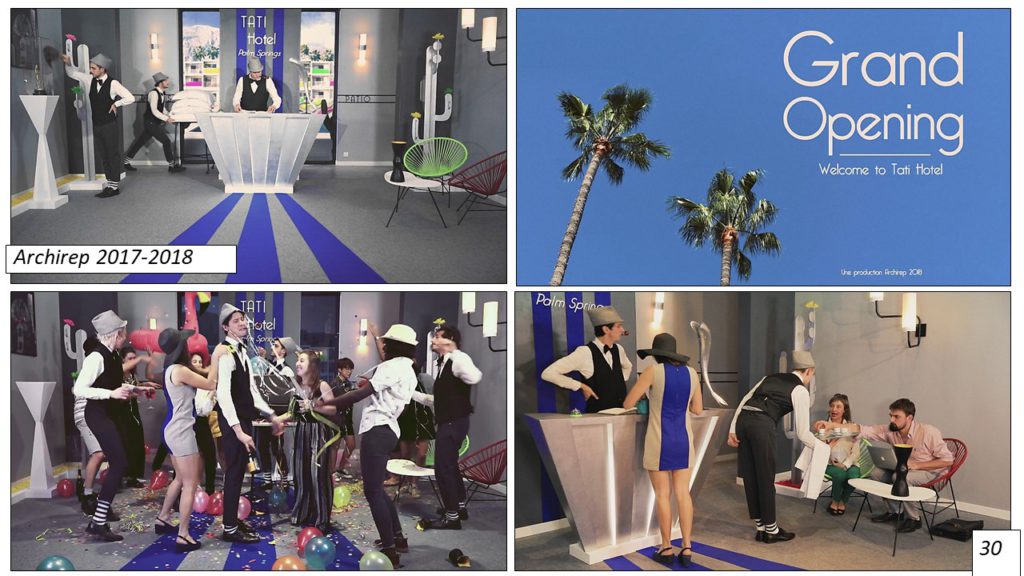
Paradoxically, the first effect that was generated was the return to the analogue, within a continuum that goes from sketch to 3D model, then to 3D printing or building, then a return to the digital with 3D scan (with photogrammetry, for example) for adjustments and reworks that can feed the loop some more. The questions are thus moving from a series of tools to design, finalise and build, to the development of processes, of a set of bridges enabling the succession of tasks, analogue and digital, while preserving the information’s integrity. The expertise is now in the ability to articulate and preserve the coherent implementation of this process. One of the symptoms of this shift is the emergence, or the return, of the “manager” term, as warrantor for a correct tasks interface, as shown in the BIM universe. As Antoine Picon notes in his book Digital Culture in Architecture: an Introduction for the Design Professions[ Culture numérique et architecture : une introduction, the digital theme in architecture represents a “literature mostly doctrinal, even doctrinaire, originating from proselytes, technophiles and other prophets of microscopic neo-avant-garde”. It remains clear that a new culture is emerging, is massively shared, and that this culture defines social ties, work pace and new perceptions of time and space.
Years ago, students came to school and said that they had tackled architecture via cinema or comics. The new generation arrives with video game references. This reference works just as well as comics in the past: wariness and disdain from the elders, adoption of new narrative codes from the youngers. Cinema influenced several generations of architects. Similarly, video games are absorbed by the generation that is currently at school, both for the representation techniques and the design of spaces and forms.
[1] Available on Youtube/ensanantes : https://www.youtube.com/user/ENSANantes
[2] Meinold J., Der Körper in der modernen Gesellschaft, München, GRIN Verlag, 2009
[3] Directed by Emeline Termet, Christelle Morisset, Charles Coiffier and Clément Perraudeau, 2008
[4] Directed by Margaux Bouvier, Cédric Dussart and Anaelle Vittaz, 2012
[5] Directed by Charlotte Savoie, Nicoletta Leone and Lionel Kergot, 2012
[6] Directed by Nayara Sampaio Gomez, Coralie Dumont, François Barcelo-Chatelier, Herbert Marchessou, 2012
[7] Directed by Alice Moreau, Joël David and Claire le Cam, 2012
[8] Directed by Monica Loza Herrera, Mirwais Rahimi, Sayed Rodullah Sadat and Jérôme Sautarel, 2012
[9] As with Grand Theft Auto, whose 3rd version in 3D and 3rd person was released in 2001.
[1] http://strabic.fr/Cluny-III-en-3D
[2] Stan Neumann is co-director, with Richard Copans, of the “Architectures” series, available on Arte, http://www.arte.tv/fr/la-collection-architectures/2798026,CmC=2798770.html
[3] Concept borrowed from Mikhaïl Bakhtine to mention the place and time of action.
[4] Smartt Bell Madison, Narrative Design: Working with Imagination, Craft, and Form by Bell, W. W. Norton & Company, 2000
[5] Coates Nigel, Narrative Architecture: Architectural Design Primers series, AD, Wiley, 2012
[6] Le Bozec Yves, L’hypotypose : un essai de définition formelle. In: L’Information Grammaticale, N. 92, 2002. pp. 3-7.
[7] Le Corbusier, Journey to the East, MIT Press, 1966
[8] Dethier J., Guiheux A. (Sous la direction de), La ville art et architecture en Europe 1870 1993, Editions du Centre Pompidou, 1993
[9] Architectures (D’), le projet en représentation, Du Croquis A L’image De Synthèse No 75, 01/06/1997
[10] Spiller N., Cybrid (s) Architectures virtuelles, Parenthèses Editions, 2008
[11] Spiller N., Visionary Architecture: Blueprints of the Modern Imagination, Thames & Hudson Ltd, Reprint 2007
[12] Picon A., Culture numérique et architecture – Une Introduction, Birkhauser, 2010
[13] Kottas D., Architecture numérique : Nouvelles applications, 2 volumes Links Books, novembre 2013
[14] Migayrou F., Architectures non standard, Ed. du Centre Pompidou, 2003
[15] Jabi W., Parametric Design for Architecture, L. King Publishing, 2013
[16] http://www.grasshopper3d.com/ et AAD Algorithms-Aided Design, Parametric strategies using Grasshopper
[17] http://www.architectural-design-magazine.com/view/0/index.html
[19] Moreno P., Simonnot N., Siret D., Ambiances à vendre : la représentation des personnages dans les supports de promotion des projets immobiliers, in Cahiers thématiques > 12, Février 2013, p. 119-128.
[20] Broadbent G., The deep structures of architecture in Signs, symbol and architecture, ed. by Broadbent, R.Bunt, Ch.Jenks, Chichester, Wiley, 1980, p.119-168
[21] Op.Cit.
[22] Smartt Bell M., Narrative Design: Working with Imagination, Craft, and Form by Bell, W. W. Norton & Company, 2000
[23] Coates N., Narrative Architecture: Architectural Design Primers series, AD, Wiley, 2012
[24] Le Bozec Y., L’hypotypose : un essai de définition formelle. In: L’Information Grammaticale, N. 92, 2002. pp. 3-7.
[25] Gracq J., La Presqu’ile, José Corti, 1970, p.140
[26] Bachelard G., la Poétique de l’espace, Quadrige, PUF, 1957, p.98
[27] Gracq J., La Forme d’une ville, José Corti, 1989
[28] La génération Y décrit la génération née entre 1980 et 2000 voir : Dagnaud M., Génération Y : Les jeunes et les réseaux sociaux, de la dérision à la subversion, Les Presses de Sciences Po, 2013
